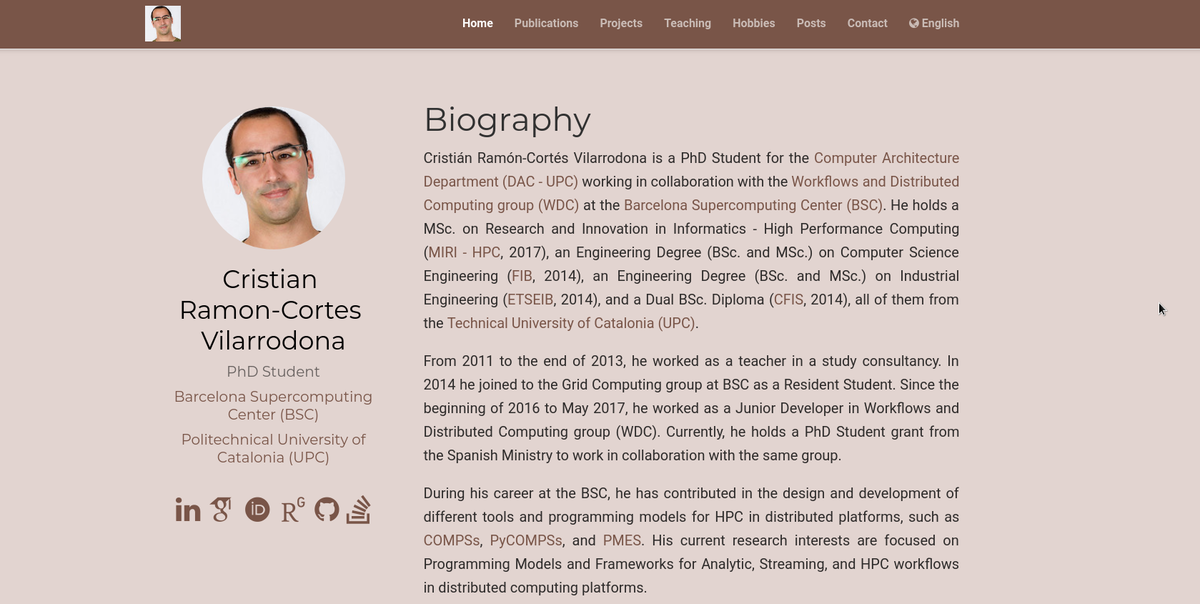
Personal website update
 Personal Website with Hugo Academic v1
The previous template had many customization options but it was really difficult for me (and I suppose for any person that totally ignores how the web world works) to get it working. Moreover, I had many problems loading screen images and making the website look custom and professional at the same time.
So... I decided to totally rebuild my personal website! This time I have used HUGO and the Academic theme. I have kept the Netlify building because I love the continuous integration with the GitHub sources and I find it really comfortable to deploy a website. So far, so happy 😃
As first impressions, you have less things to customize than the previous Jekyll template but in a much more easier way. I mean, you need to use a single scroll page (rather than different web tabs) filled with Widgets (that are basically sections) and the rest is built automatically. I do not feel very capable of breaking that structure (I do not even know if it is possible already) but maybe others feel the lack of having different tabs for different kind of information. However, HUGO and Academic provide a super-easy integration with many tools and social medias by only editing the links on a configuration file. Moreover, you can switch between 5 or 6 different color themes that really make the website look custom and professional.
Although I found some bugs (mainly with the Disqus integration and processing the HTML in the name and organization settings), I believe that for me this is just awesome!
Finally, as I stated in the previous post, I have never been nor a Web programmer nor a Designer so I may be ridiculously proud of something very simple. Please, feel free to leave any comment or improvement but be benevolent!